
Because I got quite a few questions about my process for scanning my watercolor art, I thought it might be helpful to put it down on digital paper. It might sound a little involved at first, but it takes me less than five minutes to edit each of my comics.
If you're reading this in your mail client and the images are too tiny, click the link in the header of this email to read it in your browser. You can see everything in more detail there.
The goal
This might be a bit of a spoiler, but here’s what we’re trying to achieve: a digital version of a comic that was painted on beige sketchbook paper using ink and watercolor.
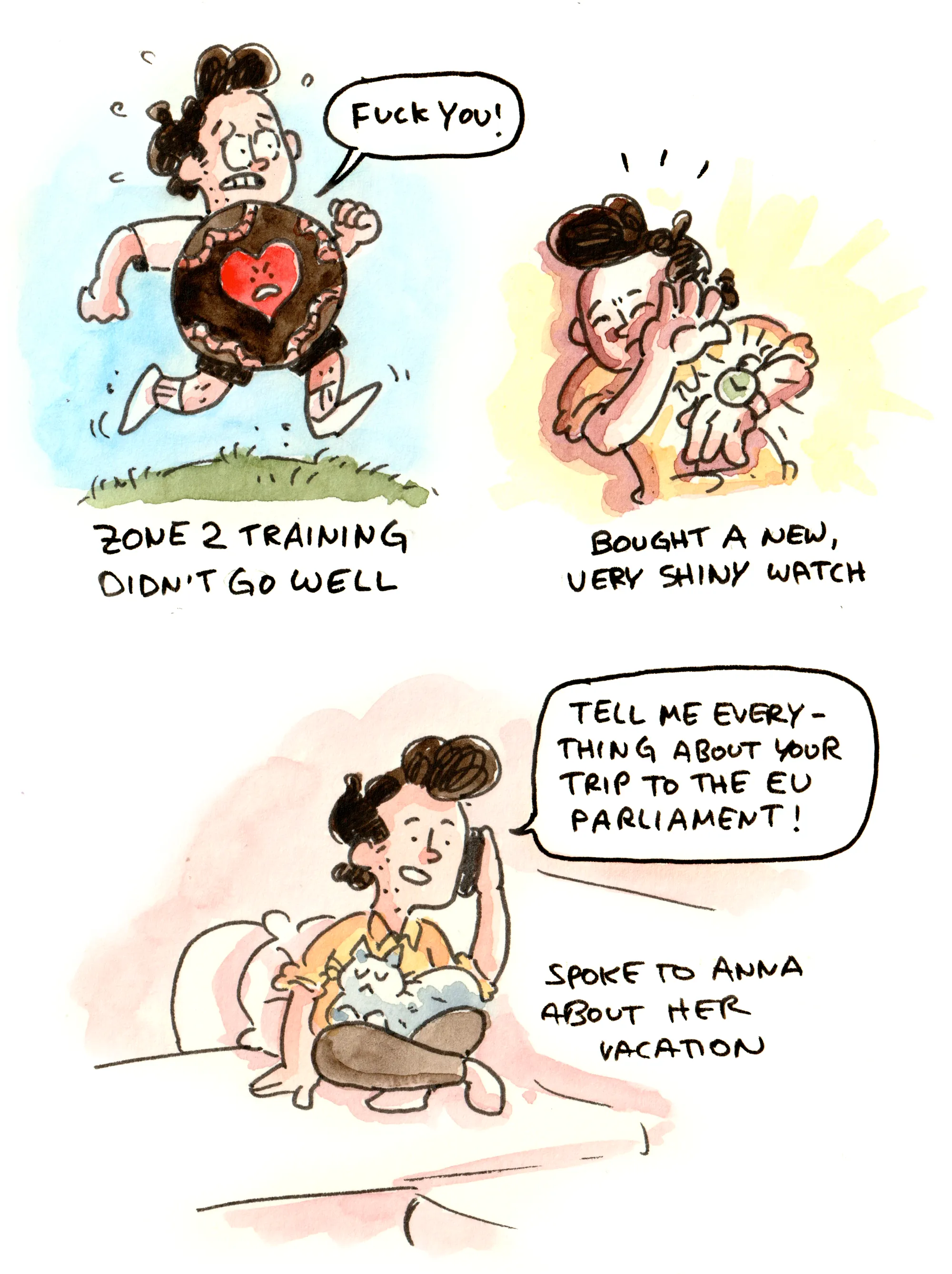
This seems trivial at first glance, but getting rid of the beige tint of the sketchbook paper without ruining the watercolor colors isn’t as easy as you’d think. That’s why we’re here!
Let’s dive in!
Step 1: Draw and paint something
I use sketchbooks from Pith for my daily comics. They have fairly smooth, low-grain paper, and the pages aren’t as yellow as those in some other sketchbooks, but neither of those things should make much of a difference to the following steps.
So, go ahead and draw something. I’ll wait.
...
Got it? Great. Here’s my artwork:
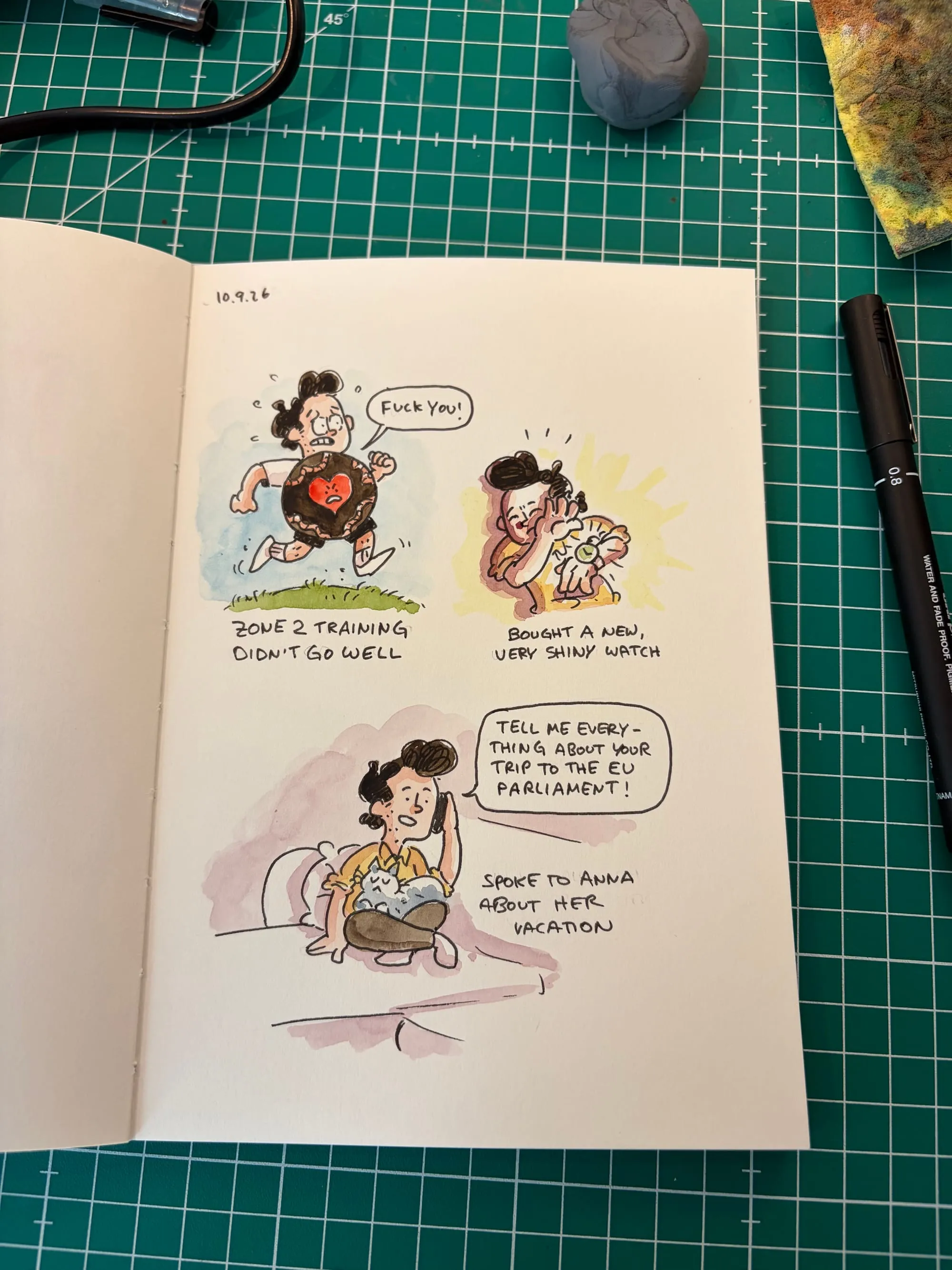
As you can see, the paper isn’t completely white, and I like my background colors (those colorful splotches behind the characters) to fade into nothingness. This would all be far less complicated if that weren’t the case, because those faded areas are the main problem we’re dealing with here.
How do we keep the watercolors visible while getting rid of the grain and beige tint of the paper?
Let’s find out. Off to the scanner.
Step 2: Scanning
I own a better scanner than the one built into my Canon PIXMA G650, but this one is good enough, and I don’t want two devices cluttering up my office. So we’re using that one.
The settings are easy. I once read someone recommending that people scan to PDF instead of JPG or PNG because PDF is supposedly the only format that doesn’t lose print quality. That’s nonsense. Like... completely wrong. PDF is just a container and can contain images of wildly different quality. We’re choosing PNG because it’s a lossless image format. If you don’t trust me on this... I don’t know, go read a book about file formats or something.
So: PNG and 300 DPI or higher.
A quick note on DPI: If you only ever want to post your work to Instagram, the actual pixel dimensions of the image matter much more than its DPI setting. But limiting yourself to a small scan just because Instagram doesn’t need more would be... stupid. Optimize for future you. You never know if you’ll want to send something to a print shop later, and then you’ll be very happy to have a high-resolution version lying around.
So do yourself a favor and scan at 300 DPI or higher. I’ll go with 600 DPI.
And if you, like me, scan a dozen things at once, all from the same sketchbook, do yourself another favor and set the custom size and rotation right here. There’s no need to rotate everything manually or crop away huge chunks of empty space later.
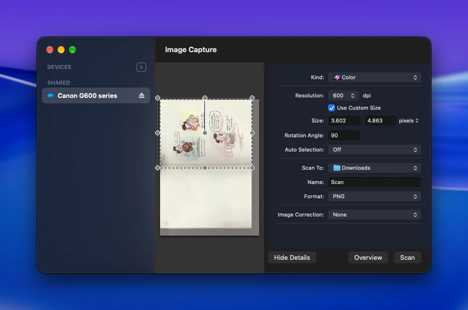
Notice in this screenshot that the preview shows a pretty obvious gradient towards the gutter of the scanned pages. Here’s what I get if I just hit “Scan” without changing anything else:
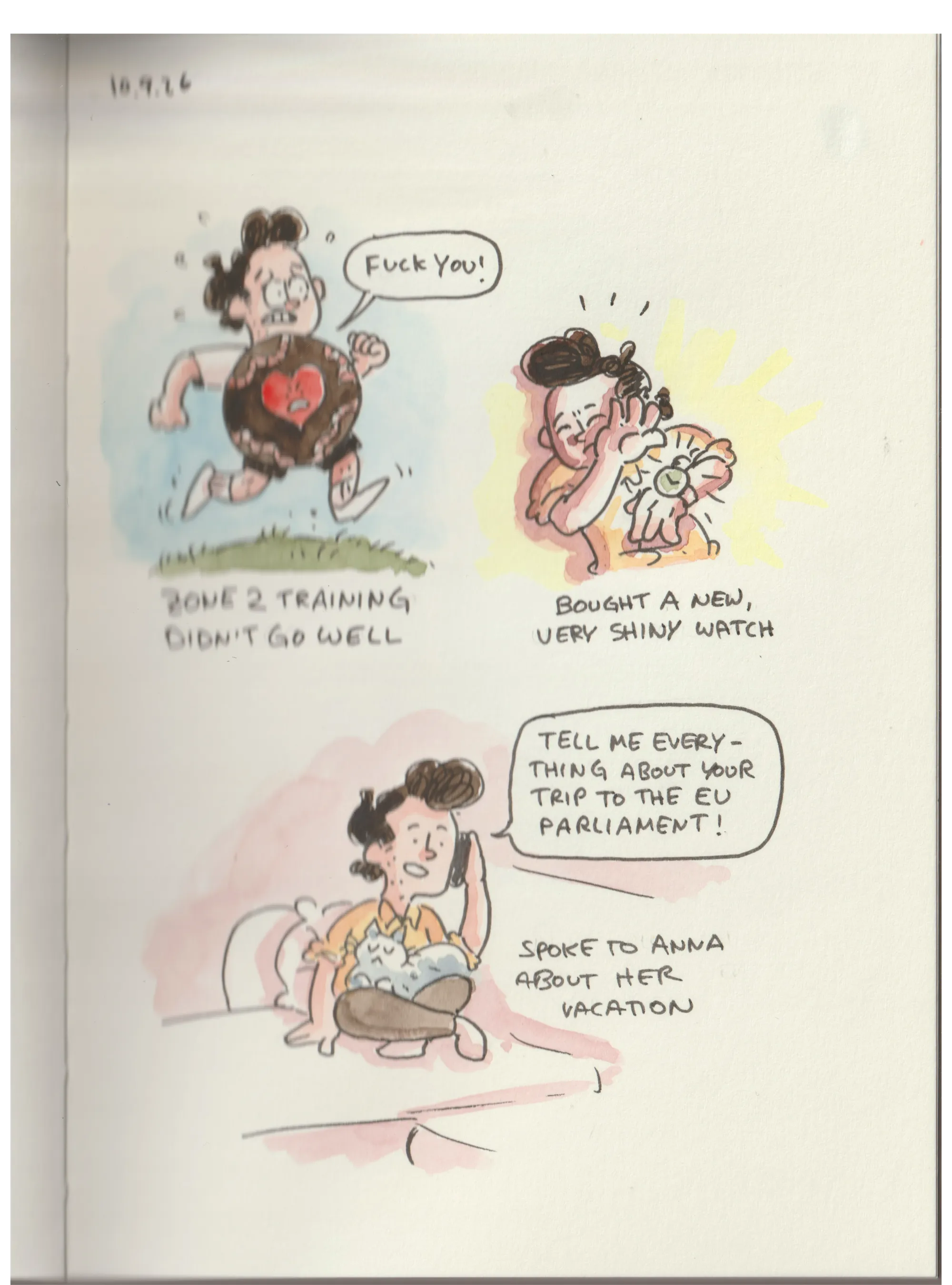
That’s bad. It’s blurry, and there’s this obvious gradient on the left side towards the gutter. Why does that happen?
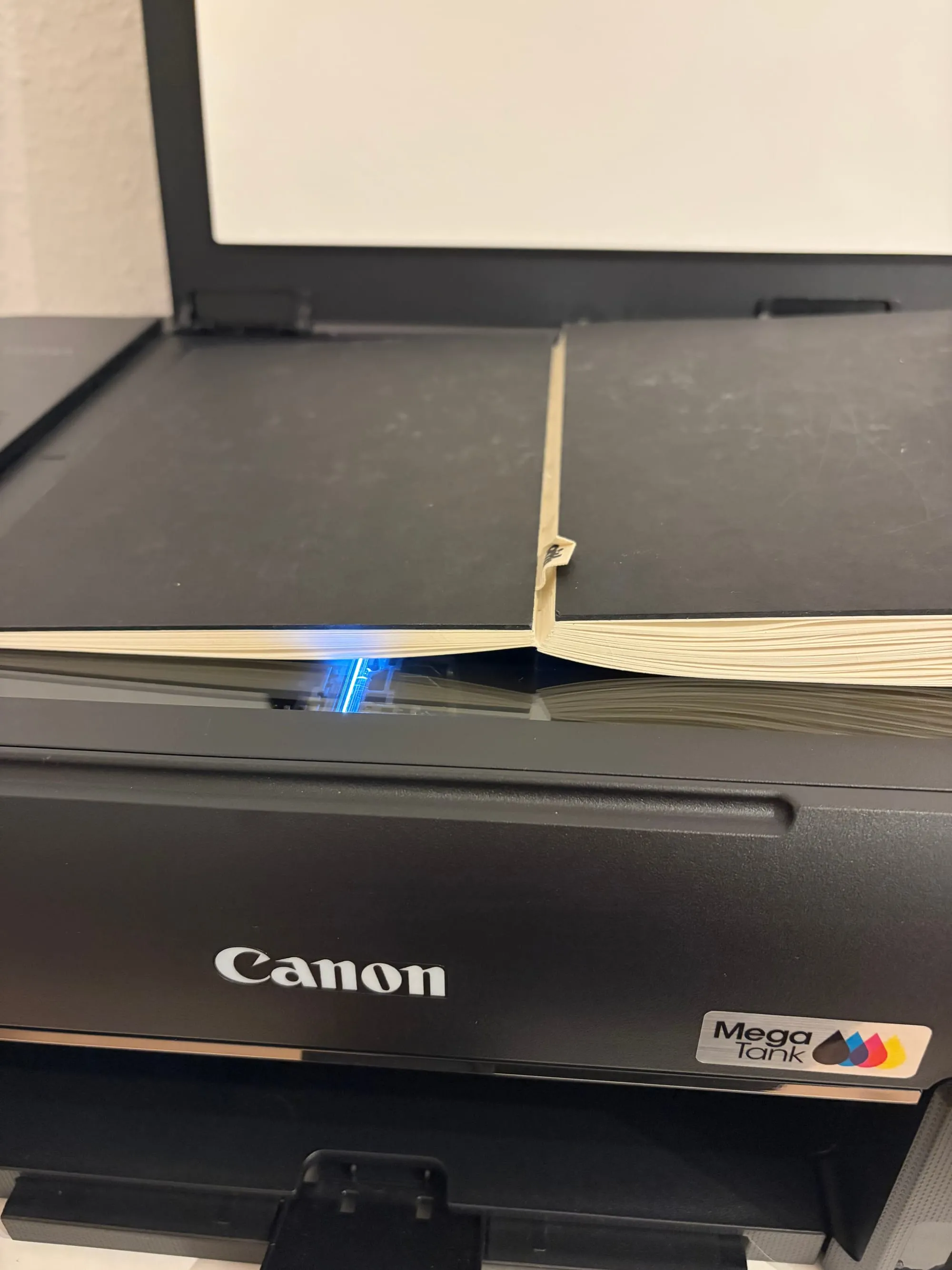
Because, as you can see, my sketchbook doesn’t lie completely flat. Physics gets in the way here.
I love Pith sketchbooks because they can theoretically lie completely flat, but you’ll need to help them out a little. So here’s how I scan my pages:
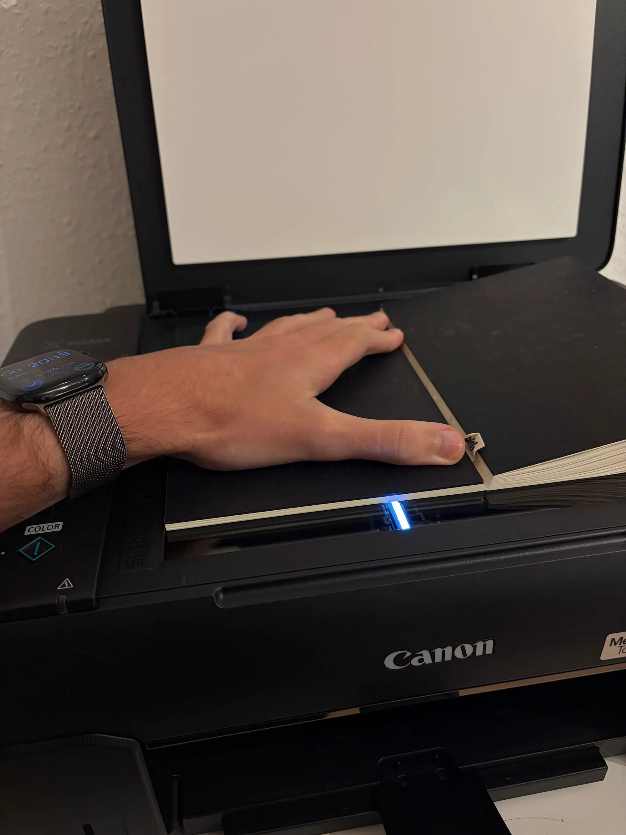
I press the page down against the scanner bed. Physical work! Very exciting for someone like me.
Well then, let’s take a look at the new result.
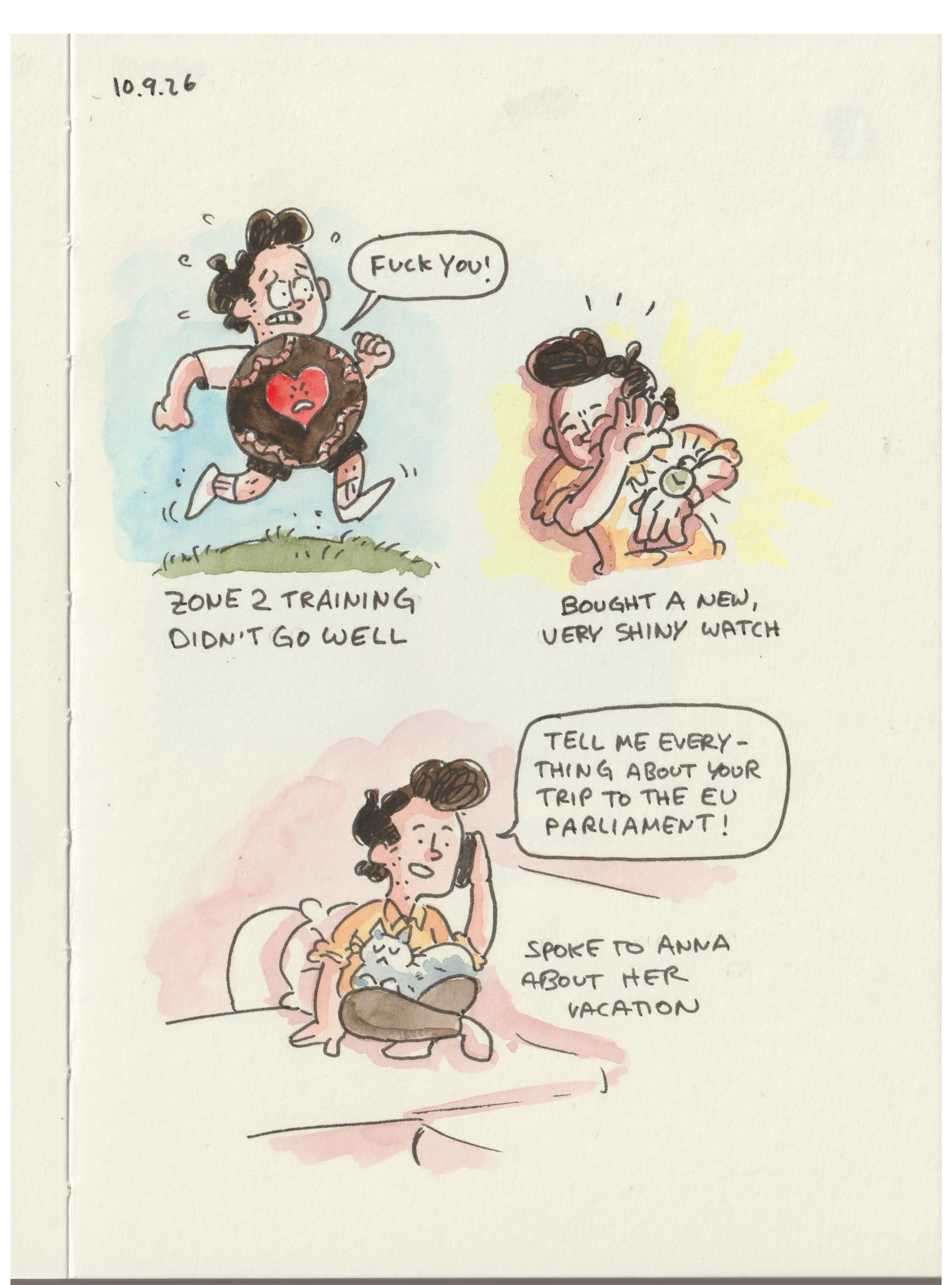
Well, look at that! Not bad! But it still doesn’t feel quite like the comic does when you look at it in real life. That’s because the scanning process seems to flatten out a lot of the contrast. I don’t fully understand why that happens, but I’m not going to let that be the end of the discussion. This is clearly not good enough.
By the way: right now, this is a 28.8 MB PNG with a resolution of 3601 × 4862 pixels. Pretty large. But we’ll get it down to something a little more manageable soon.
Step 3: Editing
If you have Photoshop, great. If you’re cheap like me and know that Affinity does basically everything Photoshop can but for free, even better.
All the screenshots here are from Affinity, but pretty much every image editing app has these tools. They all look more or less the same and work in basically the same way.
I won’t go into detail about how to use these apps here. That would be too much. Sorry. Perhaps that book about file formats has more information on that.
Let’s open our scan in Affinity!
Cropping
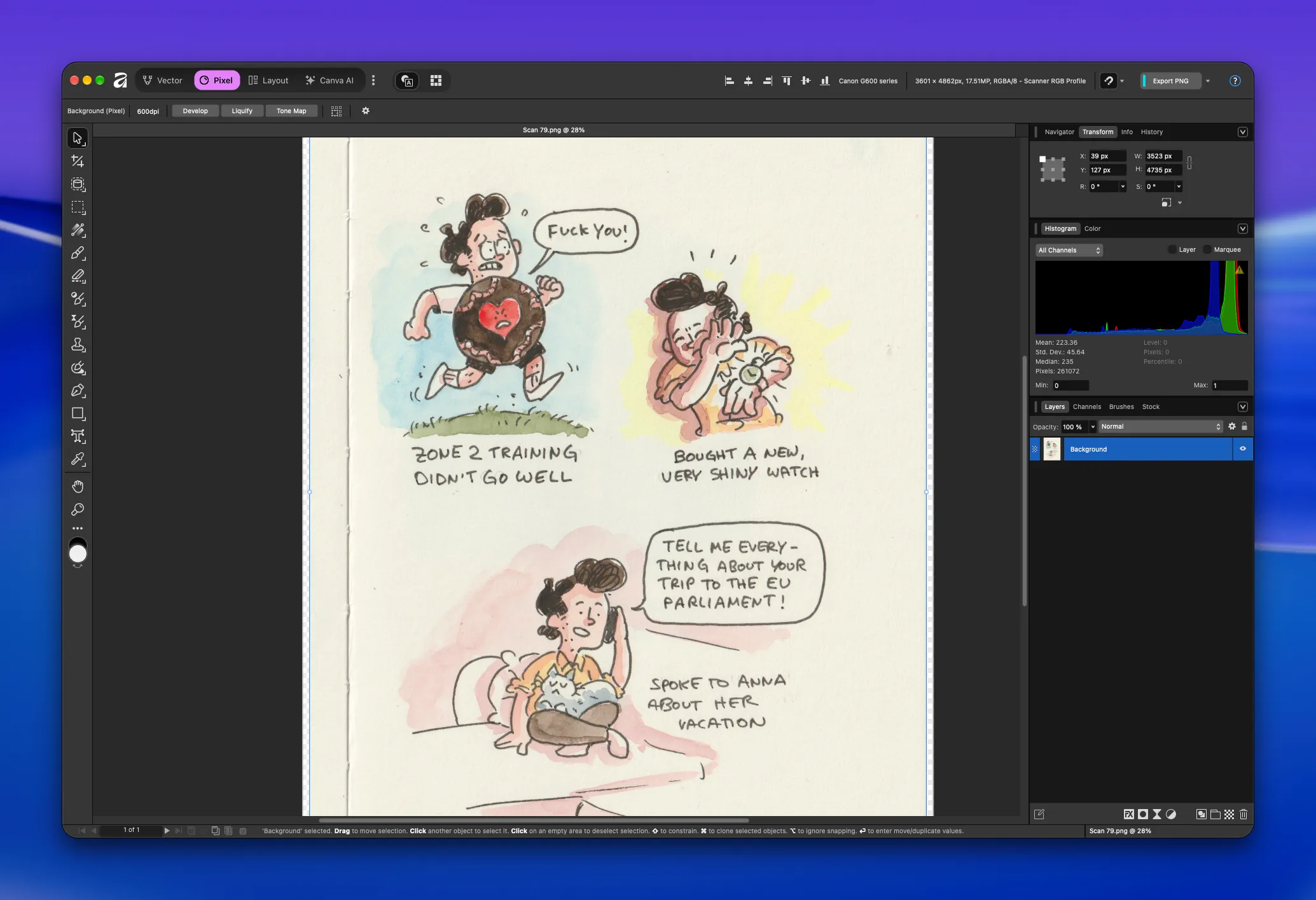
As you can see, we scanned in a bit too much. No problem. Let’s grab the crop tool and trim off the excess!
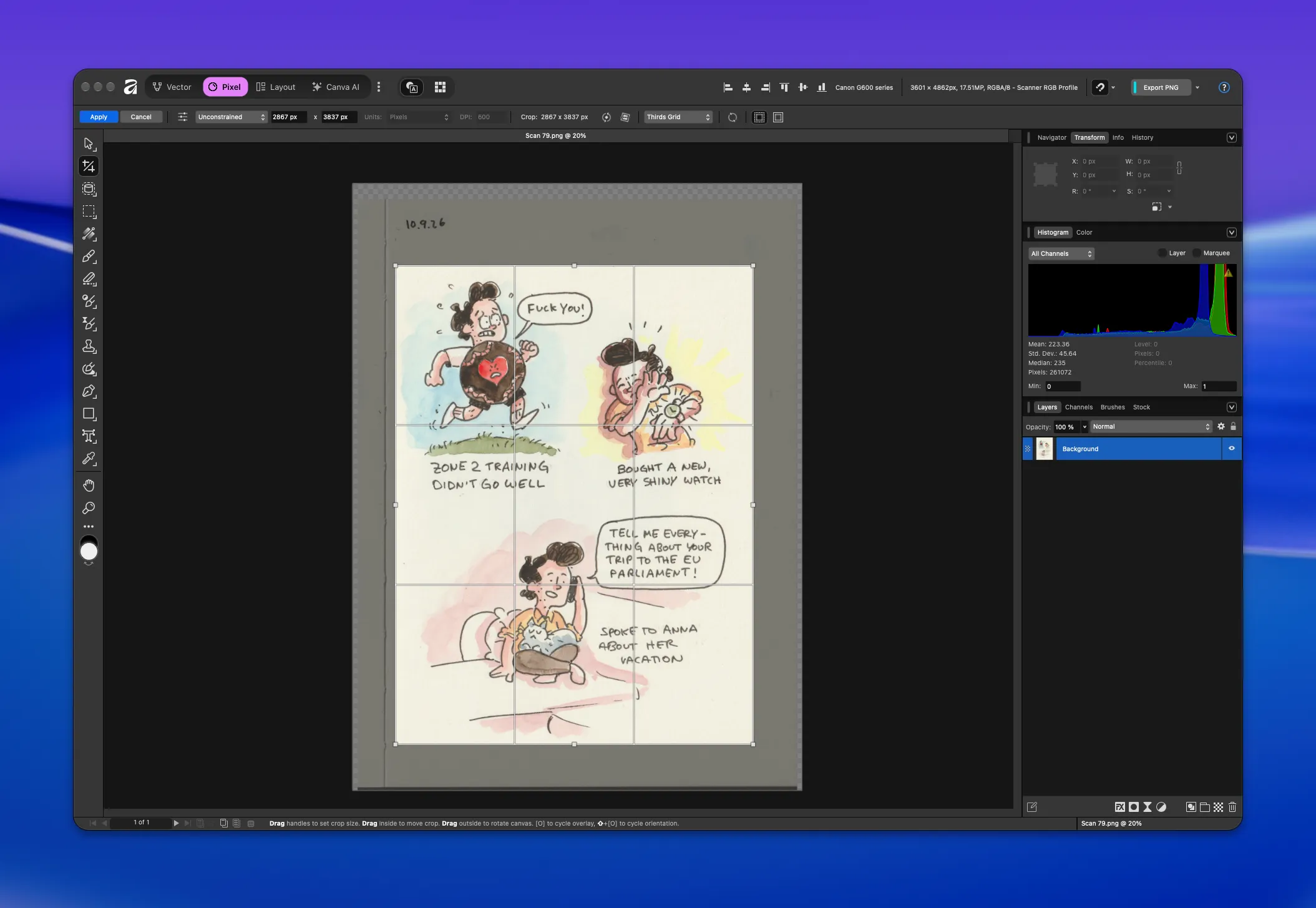
Here's the result. Looking good!
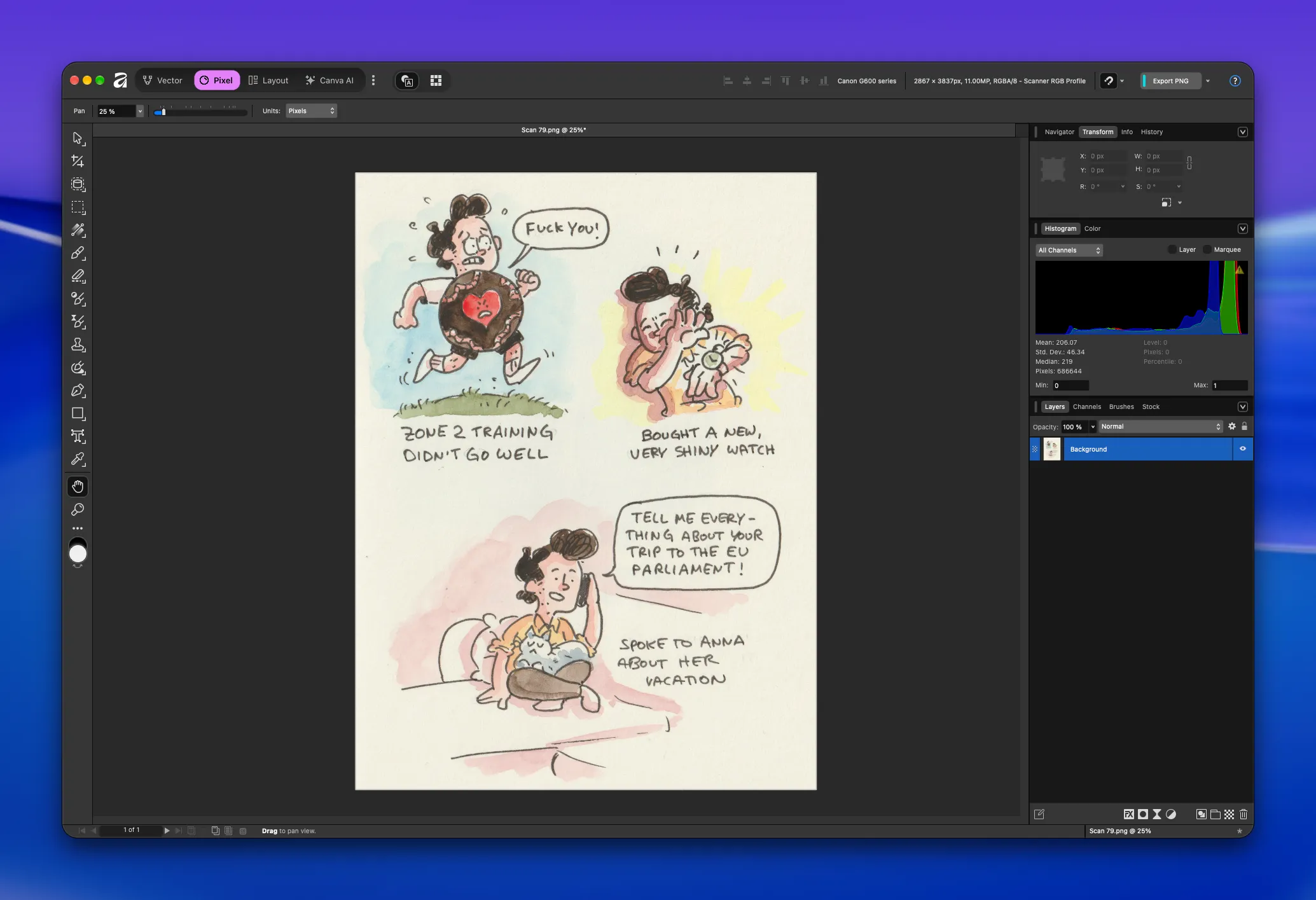
Getting rid of the beige
The most important goal here is to get rid of the beige background. That’s also where most of the work happens.
First up: Levels!
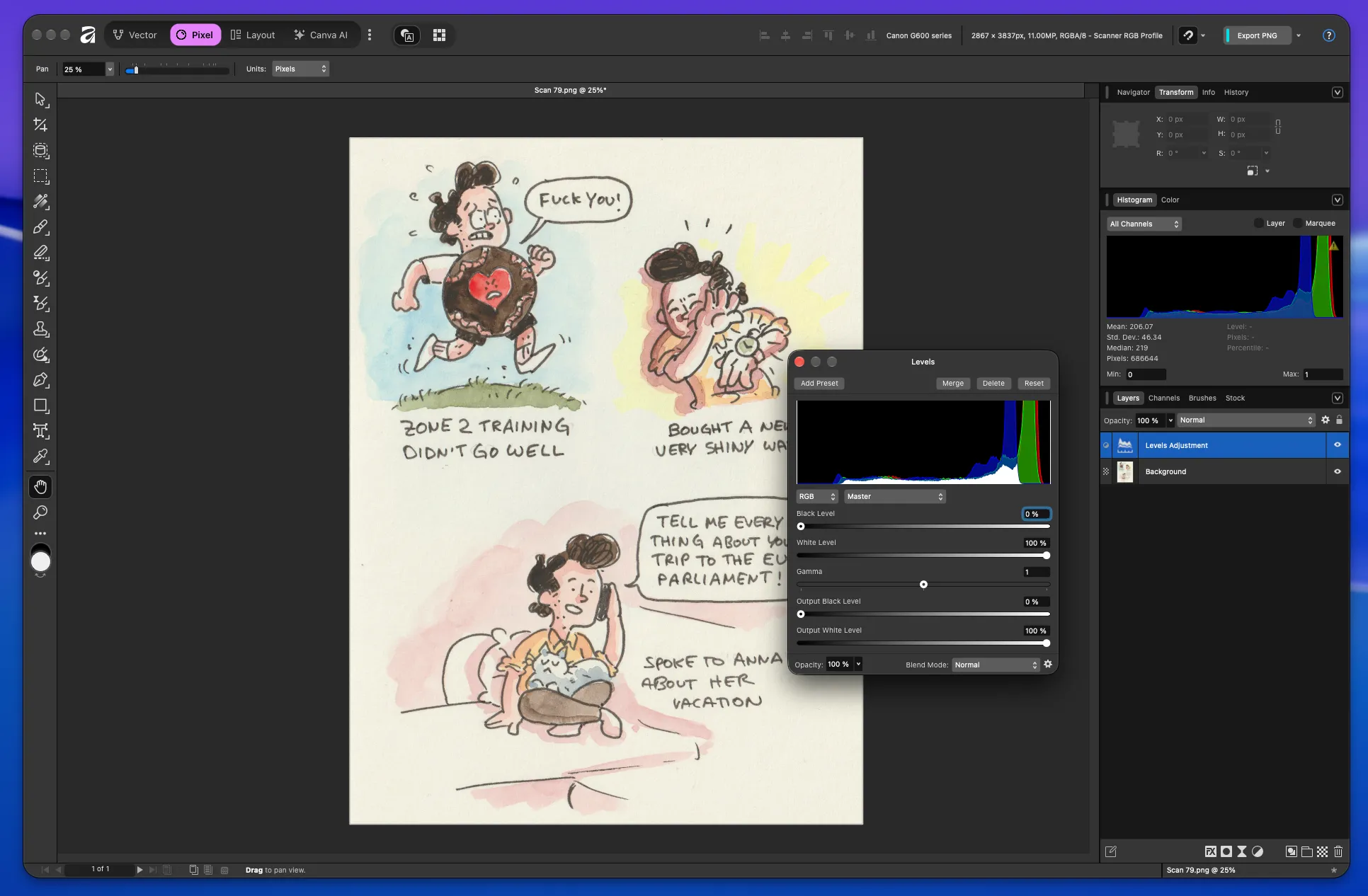
We add a Levels Adjustment layer. If you’re fluent in the ancient language of histograms, you can already see our problem right there. If you aren’t and, let’s be honest, who is, don’t worry. You don’t need to be.
What we’re going to do now is drag the right handle of the “White Level” setting to the left until we’ve removed as much of the beige as possible without losing any detail in the watercolors.
I’ll show you what I mean:
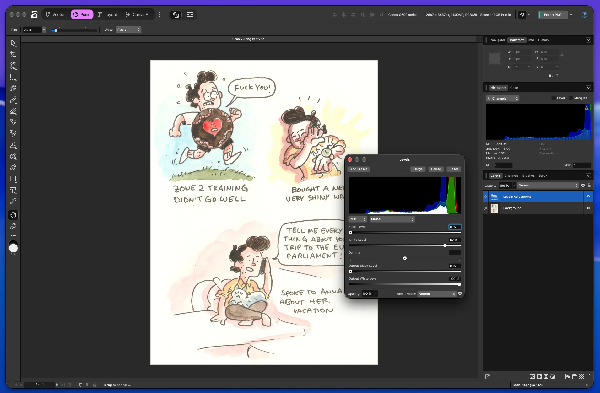
This right here is a great spot. But you might now be wondering how I got there, and that’s a good question. I had to learn something new to figure out how to do this properly.
There’s a shortcut I didn’t know about that makes the effect of the Levels adjustment much easier to see. If you’re on a Mac, hold down Option while dragging the White Level slider and you’ll see everything in inverted colors.
Like this:
This is a bit confusing at first. Holding down Option changes all the colors, so have a look at the background first.
Everything starts out white, which means nothing in that area is being affected by the current White Level setting. As I drag the handle to the left, things slowly start showing up, although the colors are obviously completely messed up. At some point, you’ll notice the background turning pure black. That’s ultimately where we want to get to, but it’s too early to push it that far at this stage. That’s why I settle on that slightly unsettling blue at the end.
What we’re doing here is making the background as light and white as possible without throwing away information in the watercolor. Watch the video again, but this time focus on everything except the background. Pay particular attention to the areas where the watercolor behind my characters fades into the “white” of the paper.
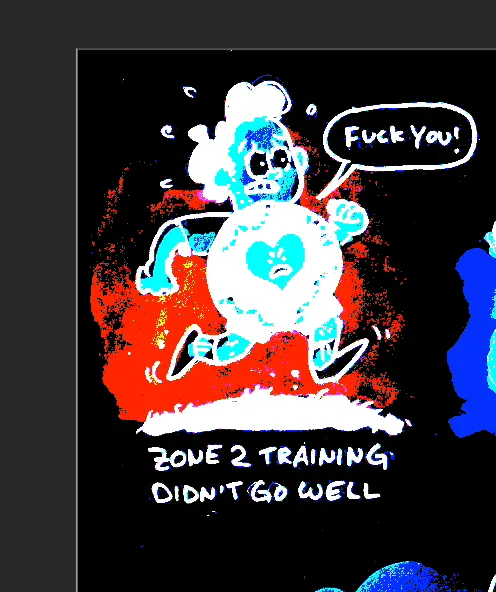
Here you can see that the background is black, which would become pure white as soon as we let go of the Option key. Again, that’s ultimately where we want to get to.
But you’ll also notice that the bright orange-red area looks like it’s being eaten away by the black. Those black patches in the orange would turn pure white, too. But they aren’t white in real life. We’d be throwing away color information here.
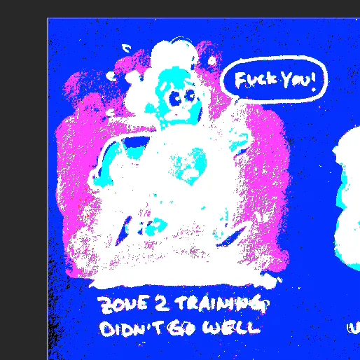
That’s why we’re settling on this state. As you can see, the area that was orange before and is now pink has a very different shape than it did when the black was eating into it.
This is the actual visible shape of my watercolor background, and we want to keep that intact.
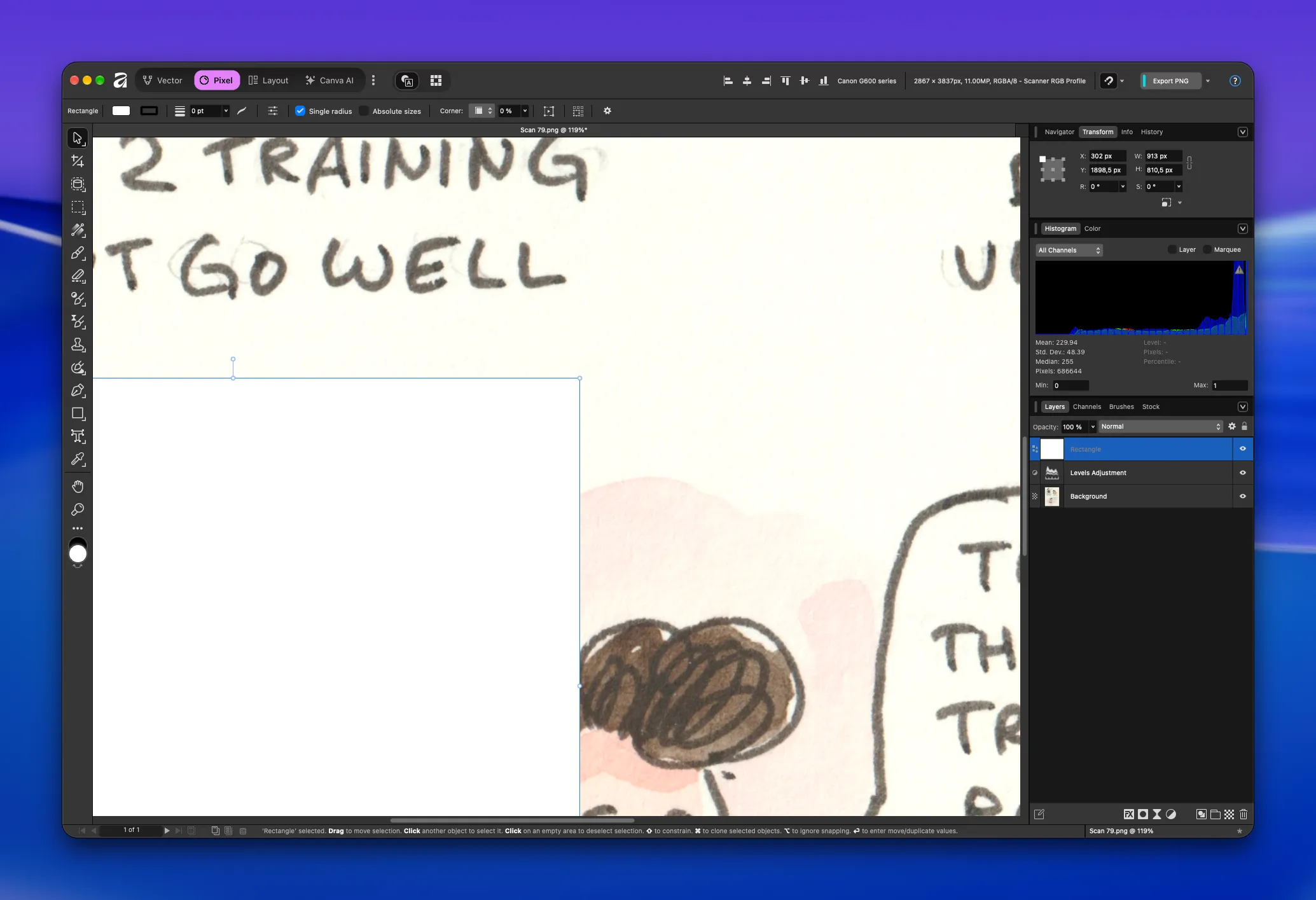
I slapped a white square onto our current progress to show you that we still haven’t reached a pure white background, even if it might look like we have without any context.
But once you post this to Instagram or put it on a website, there is context: the white background of the app or site. And suddenly, our comic looks very yellow again.
Next step: more contrast!
As a reminder, this is where we are right now:
Now we’ll drag the left slider of the “Black Level” setting. There’s no real rule or specific target here. I just move it until I like the way the comic looks.
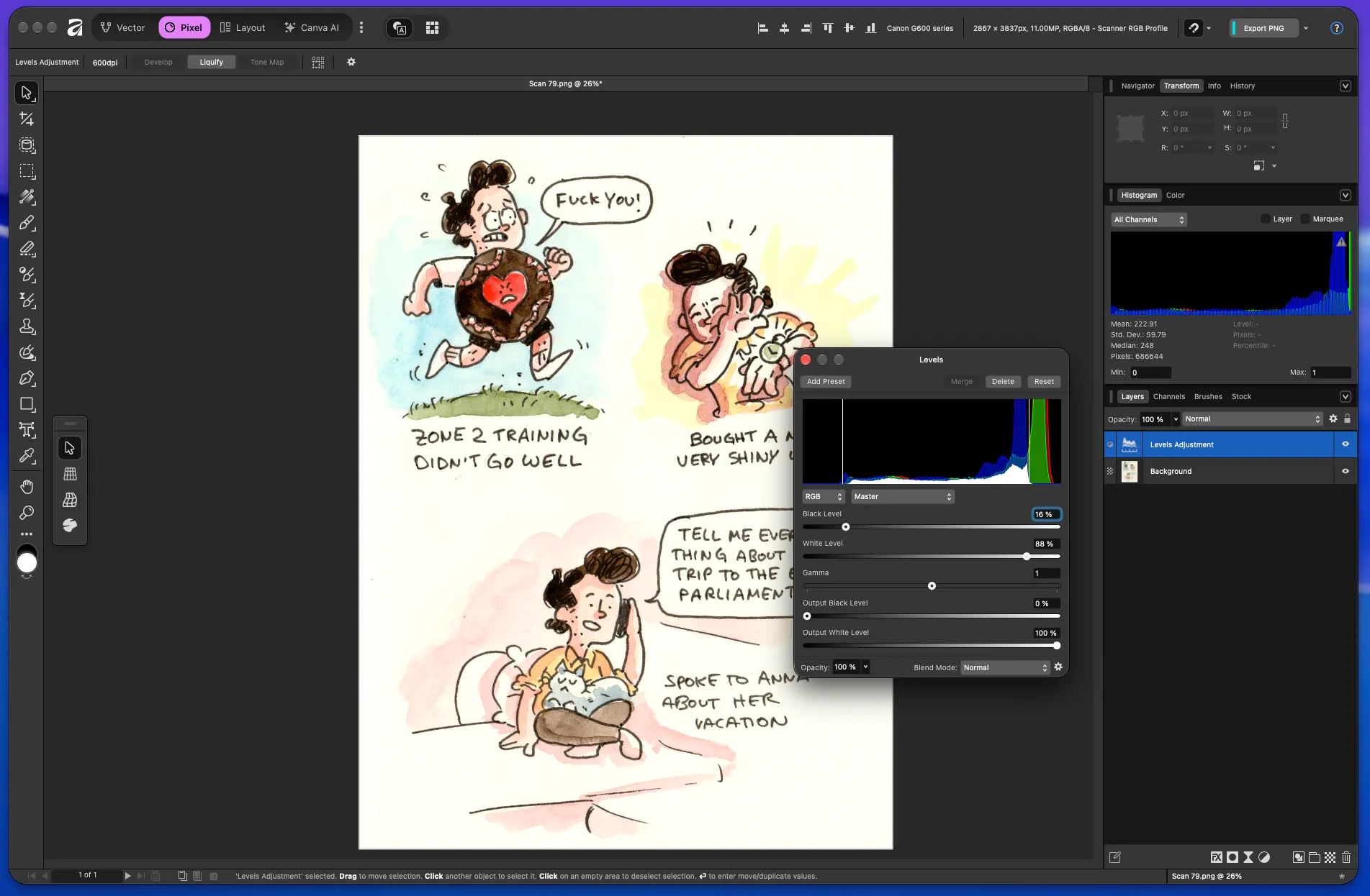
This works for me. It’s not completely black, which would make us lose detail in the darker values, but it doesn’t lack contrast anymore either.
Now, are you ready to get dirty? This next step sucks, but it’s the most important one. We’re going to get rid of the last bit of beige in the background.
Close the Levels adjustment layer and...
create a new one!
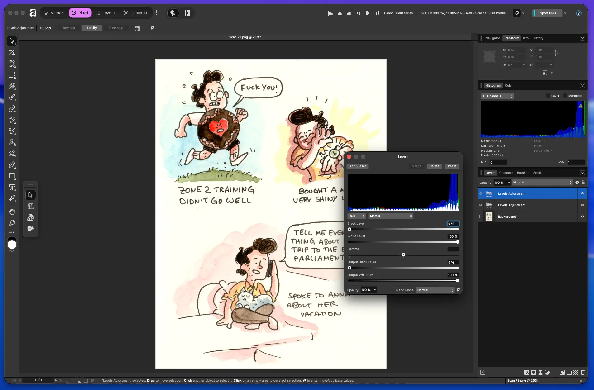
Notice in the Layers panel on the right that we now have two Levels layers.
What we’re going to do next is push the background all the way to pure white using the same trick as before. Hold down Option, drag the White Level handle to the left, and stop when everything that’s supposed to be completely white has turned completely black.
As you can see, we’re cutting into the watercolor areas now, and everything has gotten uglier again. That’s by design.
Here’s where we are now:
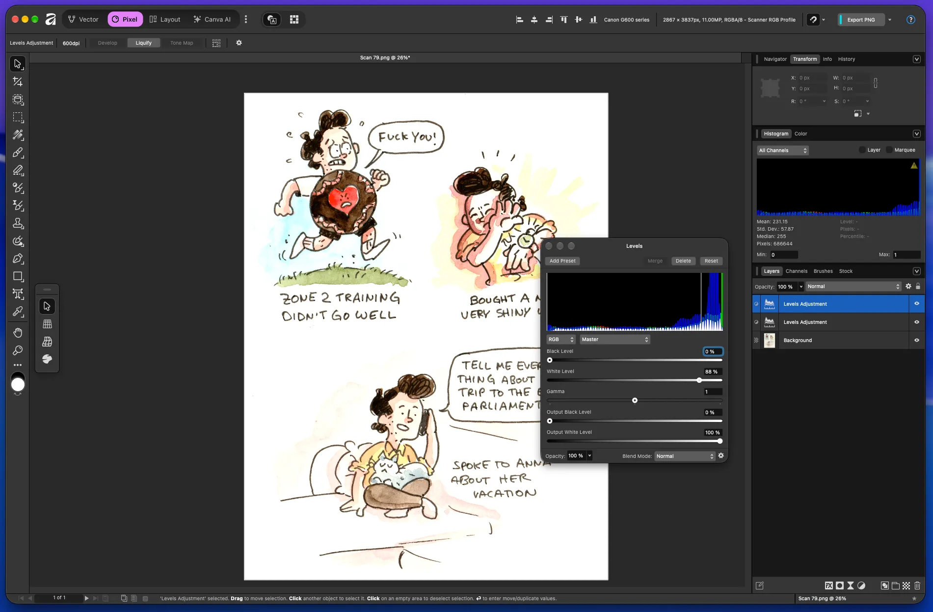
And you know what? We did it! We have a completely white background now. Great. We’ve optimized everything for the areas that don’t contain any of our actual artwork.
So what now?
Well... I told you this was going to get dirty for a second, so bear with me.
Here’s the plan: We’re going to cut holes into the second Levels adjustment layer so that those areas are no longer affected by it, letting the lower layers show through.
And with what?
A good attitude and... masks!
Let me show you how to add a mask to that new Levels adjustment layer:
Easy as that. Masks can be a little tricky to wrap your head around, and I won’t go into all the details here. For now, let’s just say this: we’ve added a mask that lets everything through.
The little mask icon on our layer is white, which means the effect of that layer is fully visible. We’re going to change that.
Here’s what’s going to happen:
- We select the mask.
- We select the Brush Tool.
- We choose pure black as our color.
- We paint over the areas where we don’t want the second Levels adjustment layer to have any effect. In our case, that’s wherever the comic has color.
This is what that looks like:
I hope you can see the subtle difference this makes. Let me finish this up properly, and I’ll show you what it looks like once I’m done.
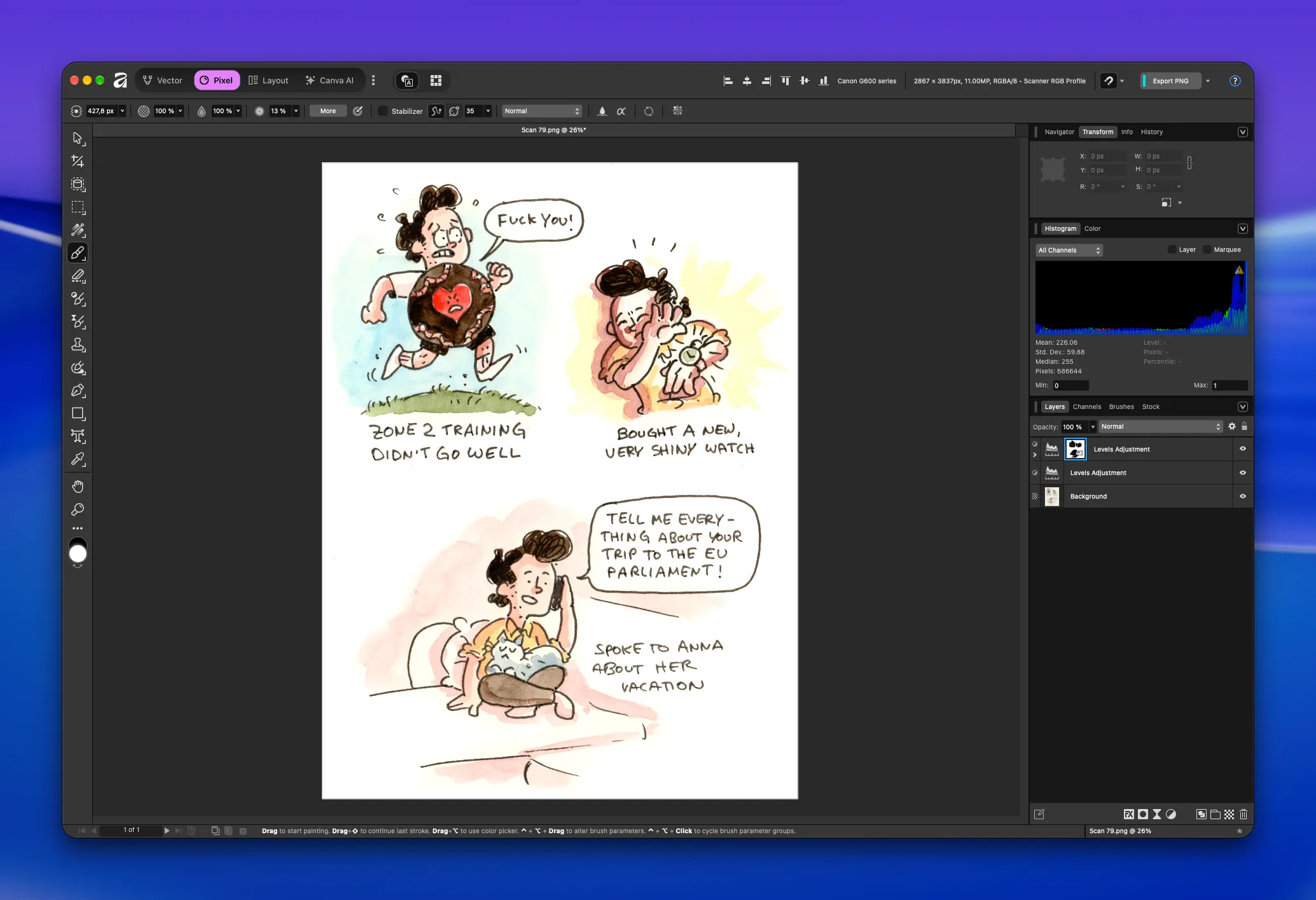
This is what it looks like now. Notice the little mask icon, which now has black splotches wherever I painted over areas that shouldn’t be affected by this layer.
Again, this layer is only supposed to get rid of the last remnants of beige in the background. We’ve done that now without losing that same beige where we actually need it: as part of the color of the painting.
There’s one little detail I still want to fix, though. I like the yellow in the background of the second panel as it is, and the same goes for the purple in the third panel. But if you zoom in on the blue in the first panel, you’ll notice something:
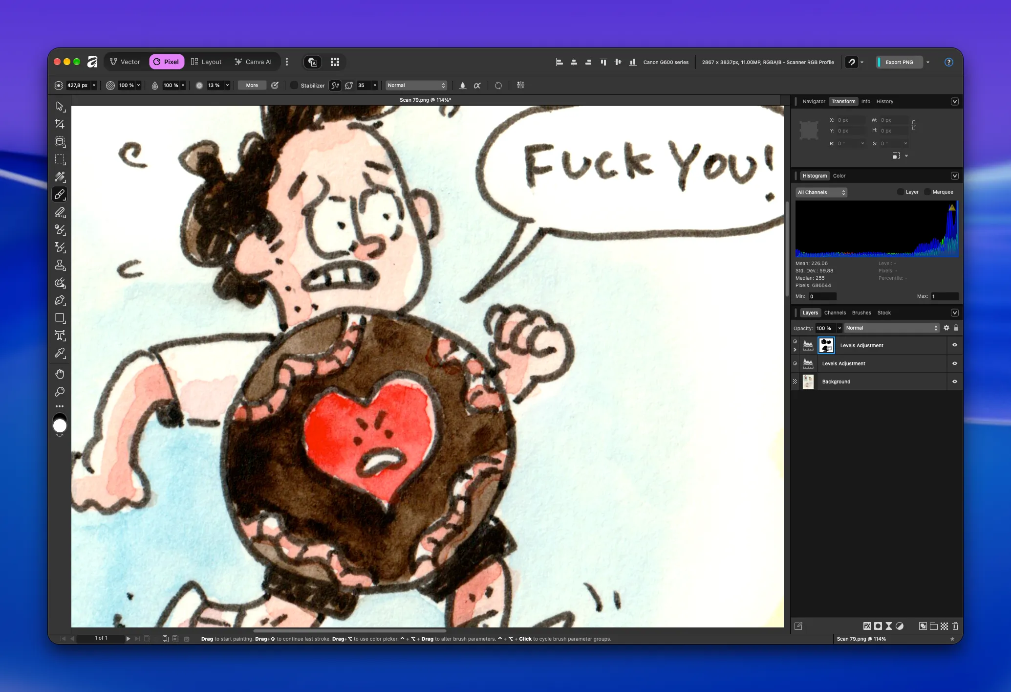
It might be hard to spot, but you can see it there on the right, where the blue fades into the white background. It looks a little dirty, and some of the beige is still shining through.
For areas like this, I like to add another Adjustment Layer, this time a White Balance layer, and shift the affected areas away from yellow.
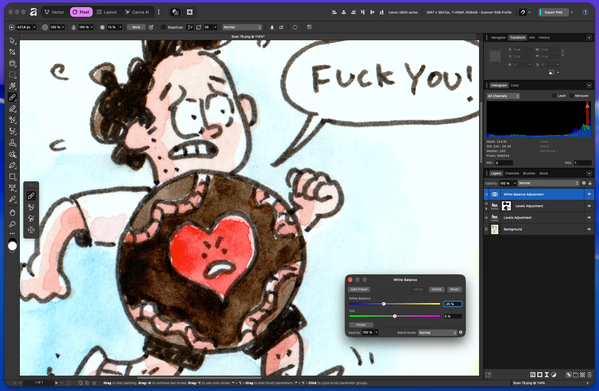
The trick is not to leave it like this. Even though it might look fine at first, we’ve actually created a huge mess: everything that was pure white before is now slightly blue.
That’s why I add another mask to the White Balance layer and invert it so that the adjustment doesn’t affect anything at all. Then, with a white brush, I paint in only the area I actually want to shift away from yellow, which in this case is the blue background behind the first panel.
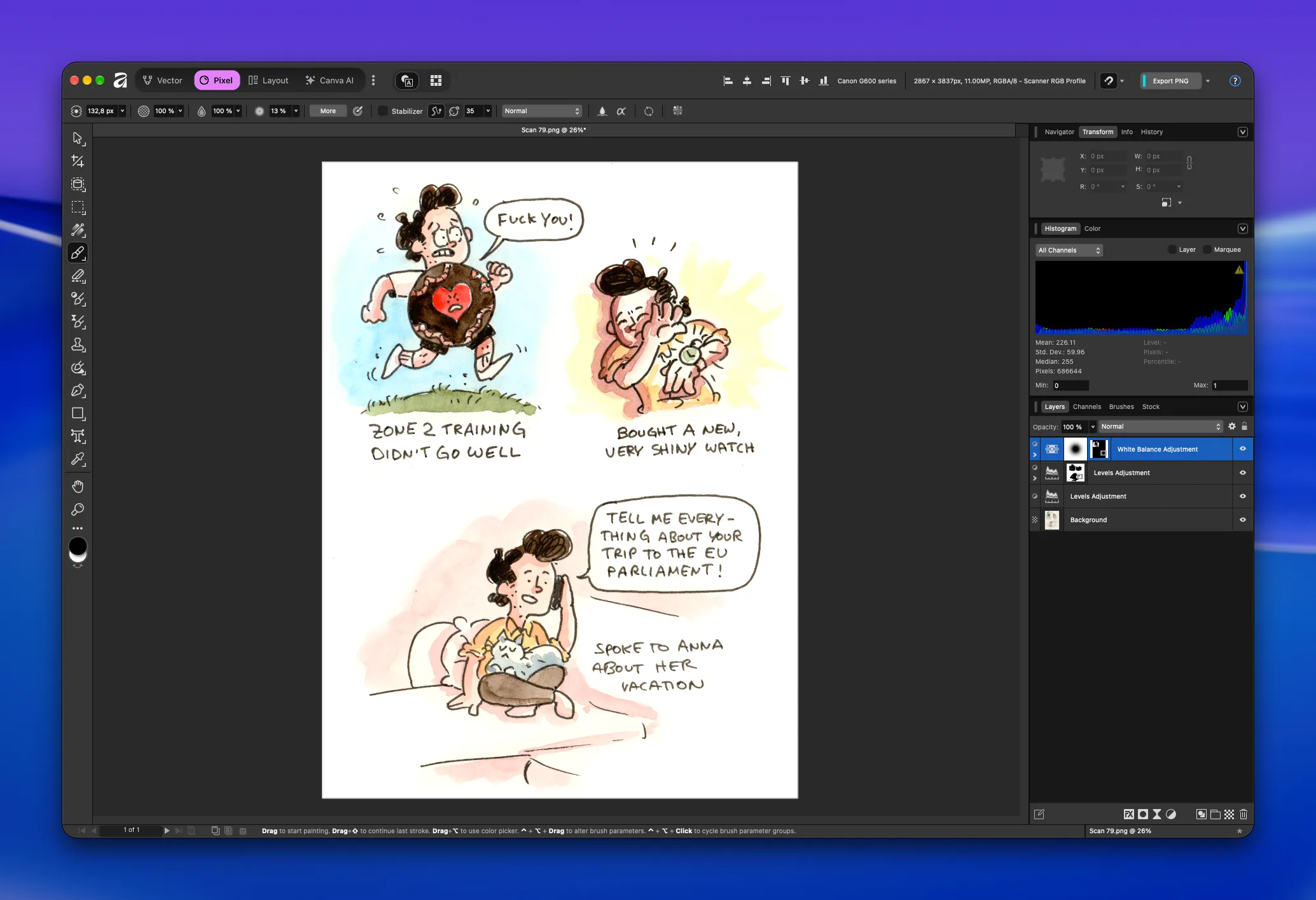
Good job! We’re nearly done. There’s only one thing left to do.
Even though this already looks pretty good, I like to give the speech bubbles and text a little more contrast than the artwork itself. I try to get them as close to pure black as possible.
To do that, we add yet another Levels adjustment layer and drag the Black Level handle from the left until the text looks dark enough.
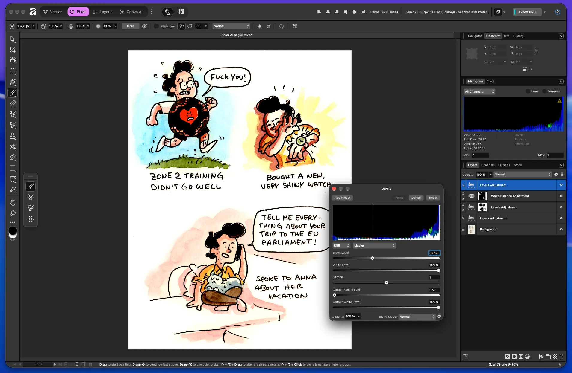
Which, once again, leaves us with something that looks worse than before. But with the help of yet another mask, we’ll sort that out.
I still haven’t found a quicker way to invert a mask in Affinity. It’s very easy in Photoshop, so here’s a quick workaround:
- Add the mask.
- Select the mask.
- Select the Brush Tool and make sure your colors are set to pure black and pure white.
- Select the whole artboard (CMD+A on Mac).
- Make sure black is your active color.
- Press Backspace.
This fills the entire mask with black, which means the adjustment no longer affects the layers below it.
Now we switch the brush color to white using the X shortcut and paint over the text and speech bubbles.
I’ll show you the whole process I just described in a quick rundown in the next video. Let’s go:
I'll do that for the whole comic and then we have it, the final result!
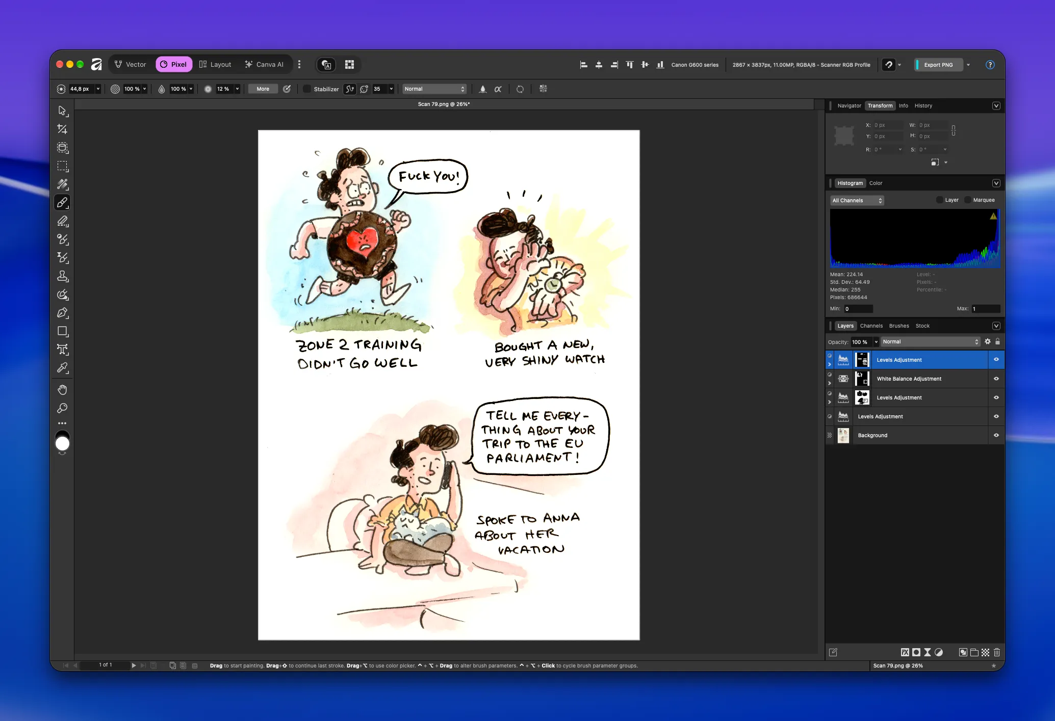
That's it! Now let's save the result somewhere (as a PNG, please) and we're done! Good job!
The Result
As a reminder, here’s where we started. It all began with a comic on paper:
Which then became a scan with barely any contrast and dull, boring colors:
And this is where we ended up:
Not too shabby!
This might feel like a very involved process, but in the end, it’s really just a handful of steps. Once you get into the flow, it becomes very quick to do.
I hope this helped! Let me know if you have any questions.
And for my best friends, the paying subscribers to this newsletter, I’ve included a couple of sketches from the past few weeks. I haven’t shared them anywhere else because they’re embarrassing, but they’re also an important part of my learning process.
